Archive for the ‘ergonomics’ Category
More ergonomics – desktop lightning: redshift
A cool new desktop ergonomics tool I started using recently is redshift. redshift is a clone of the f.lux package, which also has Mac and Windows versions (There’s also another fork of redshift called redshift-gui, but I’m using the plain redshift which works fine for me)
Side note: some corporate firewalls seem to block the f.lux page because it contains flux minus dots (like the botnet?)
The basic idea is to adjust the light temperature of your screen to your inner clock and vice versa. Your inner clock running in a circadian rhythm regulates your sleeping schedule, body temperature and lots of other things. The human clock (or rather the clock of near all animals) does not have an exact 24hour period, but runs slightly slower. To keep your rhythm aligned to the day it regularly needs to be re-adjusted by a zeitgeber. This is normally done using day light input to your eyes, using brightness and light temperature (red for evening etc.)
Now the problem with people like me (and likely you) who do stare for long times into computer screens is that the lightening does not change there, unlike natural light. The light temperature stays cold like at noon, even if it’s in the middle of the night. This doesn’t give any cues to your internal zeitgeber.
You configure f.lux/redshift with your position and they compute the current position of the sun and adjust the light temperature of the screen based on that. This generally means that the screen gets more and more red towards the evening. In the night it stays still red
(I guess that’s not fully natural because real night is dark, but then a dark screen wouldn’t be very practical. Perhaps we had a few hundred thousand years to adjust to staring into red fire at night though, but I don’t want to get into evolutionary psychology style just so stories here)
This should make you more sleepy towards the evening and keep your sleep rhythm nearer normal day/night.
Does it actually work? I’m not sure, but I like it at least. (but perhaps that’s just because I don’t mind my screen having a red taint — you can tell what times of the day I prefer for work) Informally at least my sleep rhythm didn’t get worse from using it, and may be slightly better. I also like the visual indication of the time.
I guess I should do a comparison study and keep some data on the sleep rhythm while using redshift and not using it, but so far I haven’t had the energy to really set up such a experiment.
The f.lux page has some more theory and references.
One problem right now is that the X server gamma adjustment does not cover the mouse, so the mouse pointer in cold colors looks a bit out of place towards the evening. I wonder how hard it would be to fix that?
I also sometimes have to turn it off when viewing pictures or movies, but only rarely.
And when you travel you don’t have to forget to adjust the coordinates.
Interesting side question: how to set up the tool when you use the laptop during an intercontinential flight? Could it help with jetlag when used the right way? But how?
Computer ergonomics II – xterms colors
After the basic setup for the xterms colors are very important. My personal theory is that always looking at the same color tires the eyes. To avoid that I use some scripts to randomize the colors based on some basic patterns.
First I have the blackterm. This is a white on black setup, but with the white and black actually being randomized shades of grey. This way all the xterms look slightly different and can be easily visually distingushed. blackterm is my basic terminal that I’ve used for a long time.
Then I got the whiteterm. According to conventional wisdom black on white is easier to handle for the brain, although I am never sure I ever quite believed it. But still it’s useful I guess. whiteterm works the same way as blackterm and actually uses shades of grey, just the white and black are switched.
I typically try to combine both the black terms and the white terms in a single desktop, with giving priority to one of them depending on mood.
Then the final piece is the randterm. The idea and data file is originally from David Holland. randterm randomizes the foreground and background colors based on a data file. Some of the combinations are not so great (but I already eliminated most of the really awful ones), but most are ok. Sometimes when I don’t like a combination I start it a few times until I get one that matches my current mood. Typically I add one or two randterms to the stable of black and white terminals to make the desktop more visually interesting.
For all of those I have large (18 pixels) and small (10 pixels) variants. The scripts default to large and can be switched to small with the --small argument.
Overall in a desktop menu you end up with 6 choices to create your xterm menu or shortcuts:
| Color | Large | Small |
| Black-on-White | blackterm |
blackterm --small |
| White-on-Black | whiteterm |
whiteterm --small |
| Random | randterm |
randterm --small |
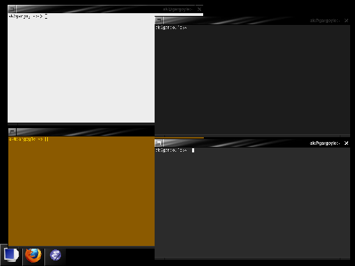
With these choices you can set up a colorfull desktop that is easy on the eyes, like this:

The same idea can be applied to other programs. I used to do the same with Emacs windows, although currently I went back to mostly plain black on white Emacs.
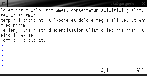
One problem with the different schemes are terminal programs that use their own color schemes, like vim or lynx or emacs -nw. They typically have color schemes for dark or light xterms that you can statically configure, but do not really deal well with having both dark and light and even randomized. Often I just turn off the colors. An easy way to do that is to start them with TERM=vt100 … The programs often fall back to using bold instead of colors then, which works for me.
At least for vim I tended to also have aliases to start vim with a dark color set and a light color set, but you always have to remember to use the right alias then and it doesn’t quite work with programs that start the editor directly through $EDITOR. So usually I just turn them off or rely on bold only.
I guess best would be wrappers that query the xterm on their current colors and select the right color schemes, but I haven’t implemented that so far.
Computer ergonomics I – xterms fonts
If you do your computer work mostly in text terminal windows like me, setting up the right ergonomics for them is very important. It always pays off to invest some time in setting up the environment you spend the most time in (like you should spend some resources on finding the right mattress you spend one third of your live on)
First I use good old xterm(1). xterm is much faster than the default terminals now used in desktops. Gnome Terminal has lots of problems: First it is quite slow, which can make a big difference for jobs that generate a lot of output like a large compilation (see the warning from the SBCL folks at the bottom of the page). And it does have strange semantics with cut-n-paste. And various other issues. I haven’t used the KDE terminal program for some time, but I remember it also being somewhat problematic. On the other hand xterm just works. xterm tends to be included with distributions, but on some newer versions you need to install the package explicitely.
The defaults of xterm are quite reasonable, except for the too small scrollback buffer. The later can be set with the -sl option or by putting a XTerm*saveLines: line into your .Xdefaults. I usually also disable the scrollbar with +sb to disable clutter.
Then you need a good font for them. The default fonts used in xterms are not great and tend to be too small at least for me. The best xterm font I know of is the sgi-screen font. This is a bitmap font that has been properly designed by a good font designer, not TTF. If you ever used an SGI IRIX workstation that’s the font used in the text terminals. Luckily SGI freed it some time ago and the font is included with OpenSUSE. The rpm installs fine on other distributions (with –nodeps), but you may need to set up the font path manually. For example in Fedora this can be done with ln -s /usr/share/fonts/misc/sgi/ /etc/X11/fontpath.d

One trap with xterms is that if you set the font using the -fn argument xterm will automatically try to generate an bold font for it. sgi-screen has bold versions of each font, but xterm cannot find it directly for some reason. I work around this by always specifying a bold font too (with -fb)
Setting the right font size is important too. I tend to use large and small xterms for different purposes. For a primary work xterm you want a larger font (I use the 18 pixels sgi-screen usually). To watch a logfile or nurse a long running compile job I use a smaller font, like a 10 pixel sgi-screen.
Setting the right size is also important. Typesetters know that too long lines are hard to read. Because of that I try to avoid xterms beyond 80 characters width.
More on xterms later.
Update: fixed link to sgi-fonts.
The Korean Tamagotchi
My Samsung mobile dumb phone has the annoying tendency to complain in the middle of the night when it runs out of battery. For some reason this always happens in the middle of the night and already has woken me up several times. The alarm happens multiple times, so if you don’t give it its juice on time it’ll wake you up later again. It’s a bit like a small kid or a Tamagotchi (are they actually still used?).
It’s very annoying. It’s interesting to think how to designers could have avoided the problem. Check the current time zone and do battery alarms in a few hours in advance during normal waking hours?